Hello!
It’s that wonderful time of the year again where we celebrate our craft, it will soon be Digital Scrapbooking Day and we’re kicking things off early at The LilyPad with some fun FREE downloads.
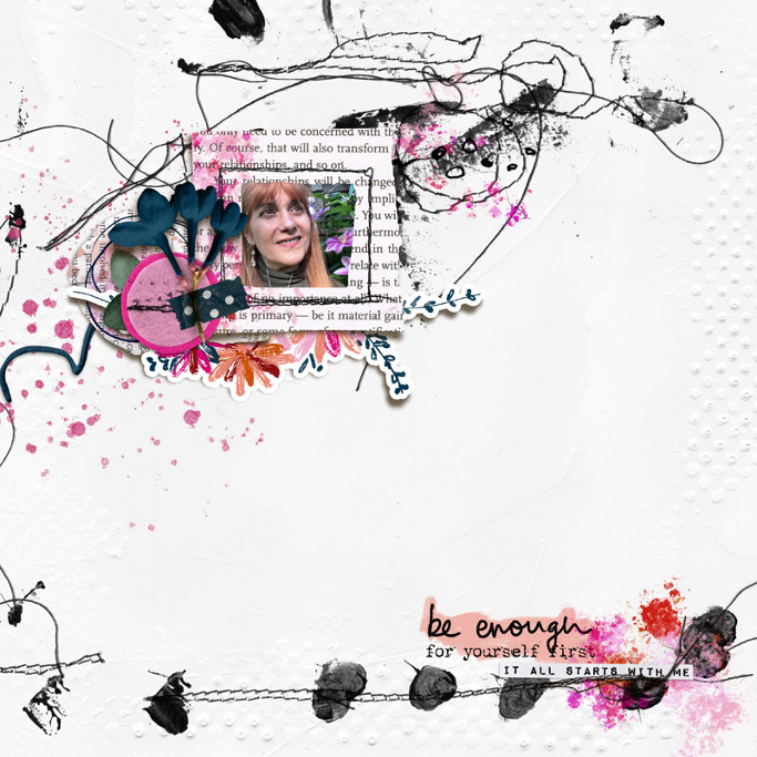
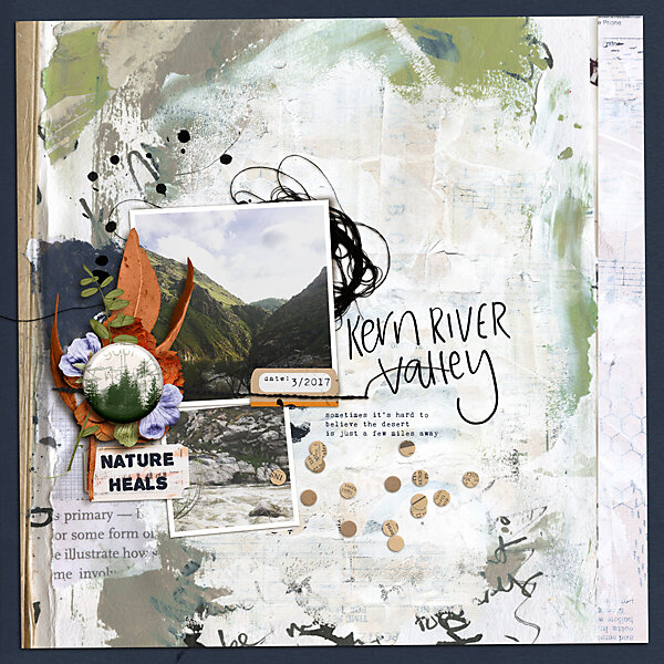
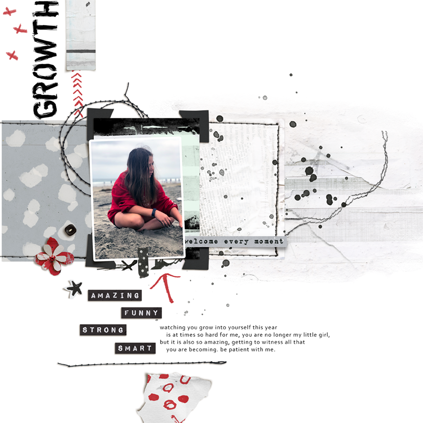
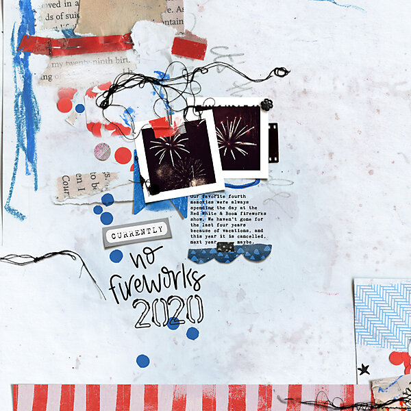
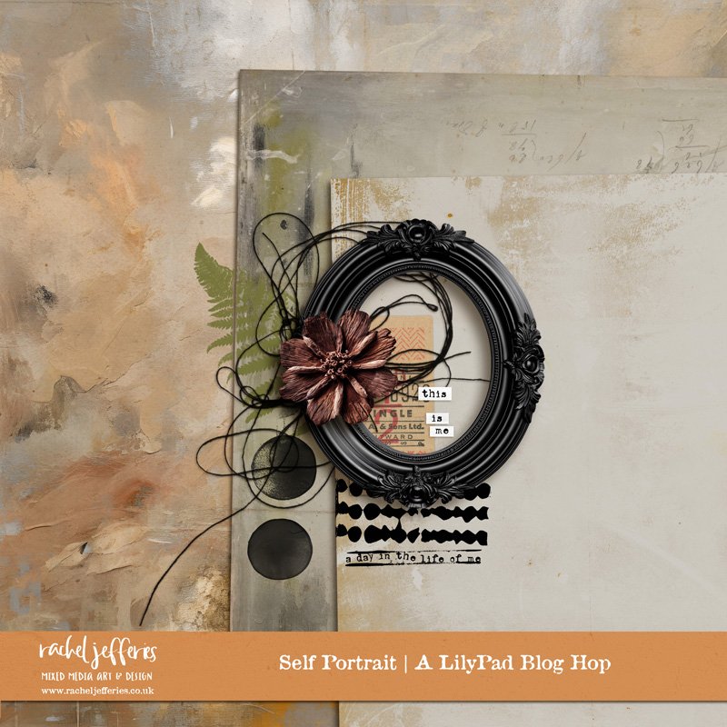
Enjoy our collection which is themed around the portraits we paint in our memory keeping. ‘Self Portraits’ is the theme of our annual blog hop and you’ll be able to collect other matching kits, Family Portraits and Life Portraits available as special free with purchase offers through Digital Scrapbooking Day weekend.
Oops you are a little late, these downloads expired on the 4th October 2023.
Join me over at my Pixels and Paint Free Community to keep up to date with new products and sales in my shops plus tutorials, hints and tips and much more for creative journaling, art journaling, hybrid crafting and scrapbooking etc.
You can also subscribe to receive the posts straight to your inbox (the best option!)

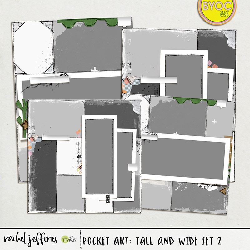
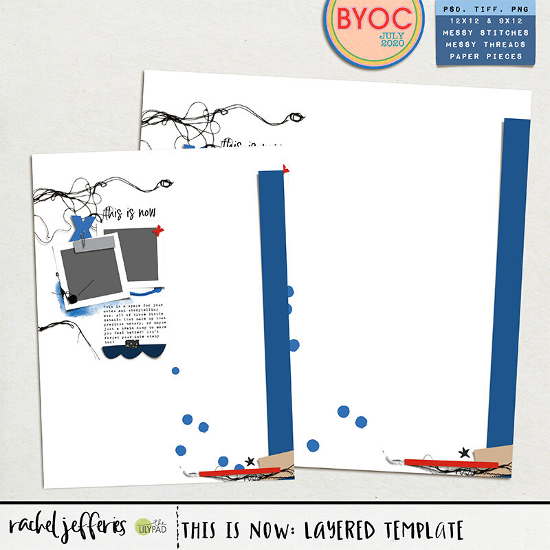
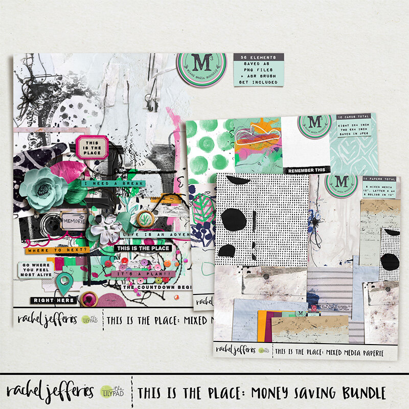
Find more Mixed Media products and templates for sale at My LilyPad Shop

Continue on to the next stop HERE which is the sweet ninigoesdigi.

Enjoy the rest of your day! Feel free to leave comments, they won’t appear right away as they have to be moderated first but I really do love to hear from you!
Rachel xo