I hope your week is going well!
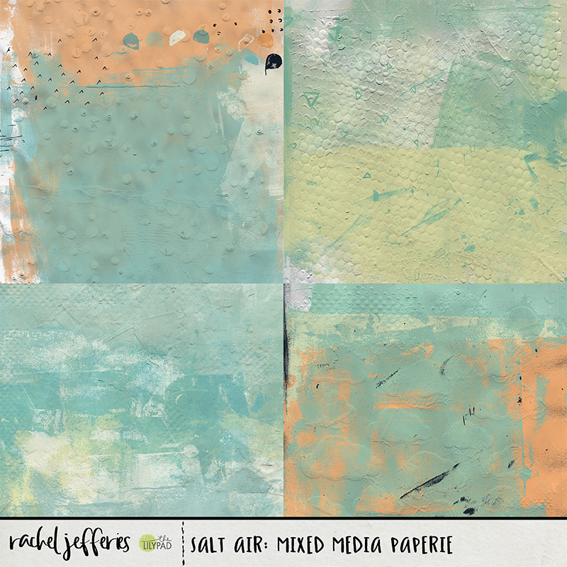
My Mixed Media Papers are handmade and are richly textured and so they make fantastic texture overlays for photos and layouts.
You can easily use a Mixed Media Paper to add a dirty or old look to your photo or page, or just for extra texture or to make it 'pop'.
Whilst working with your layout in it's layered form you can choose to add the overlay to the background paper, the photo or the frame, or on top of the entire page. For my examples I actually put the overlay right over the top of my entire page. You will need to experiment and see what works best for your page. In my example I didn't have many dimensional elements, if you do, you might find that the overlay looks better sitting on the layer behind anything that is really dimensional with large drop shadows. Experiment and figure out what works best for you!
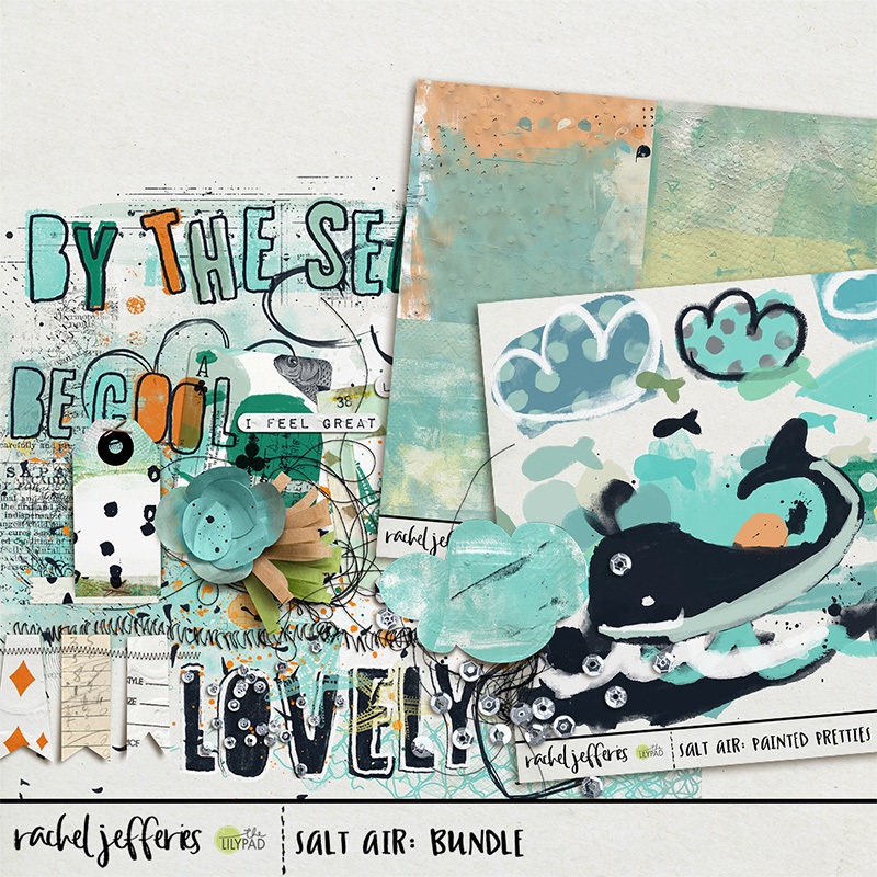
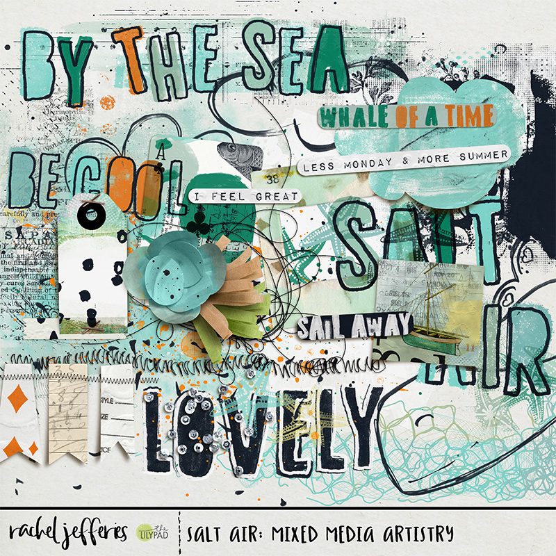
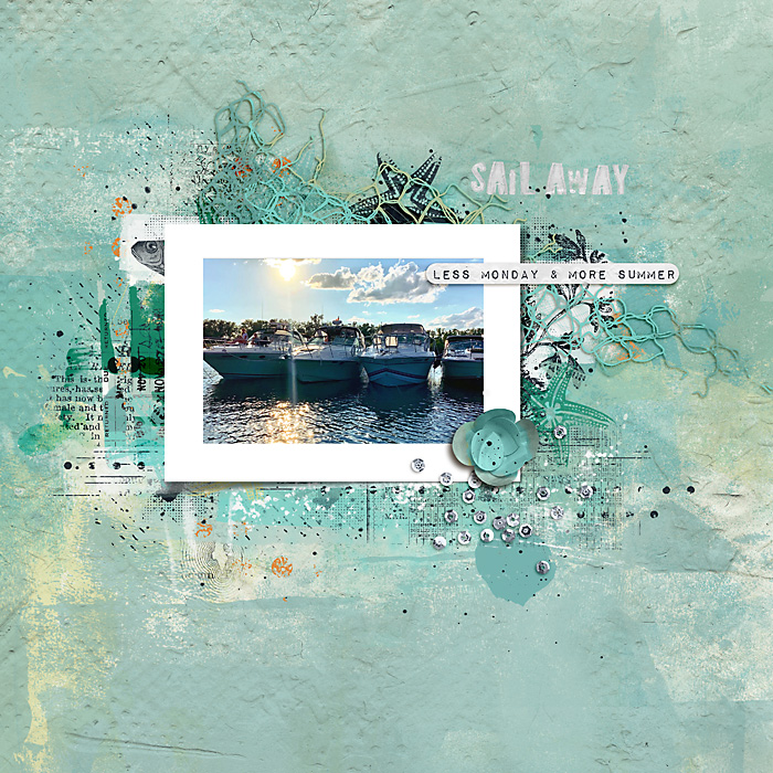
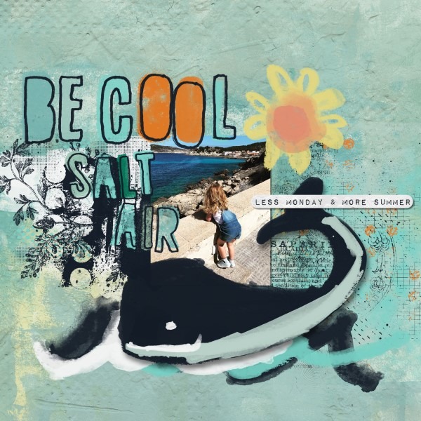
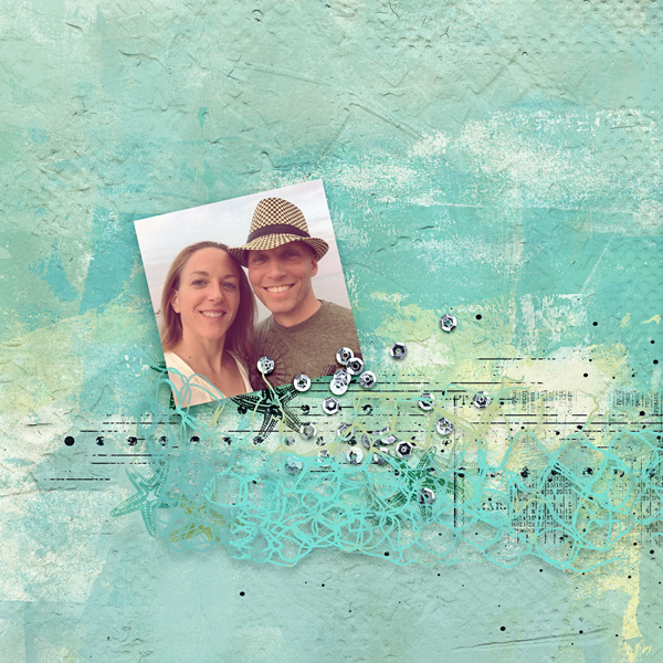
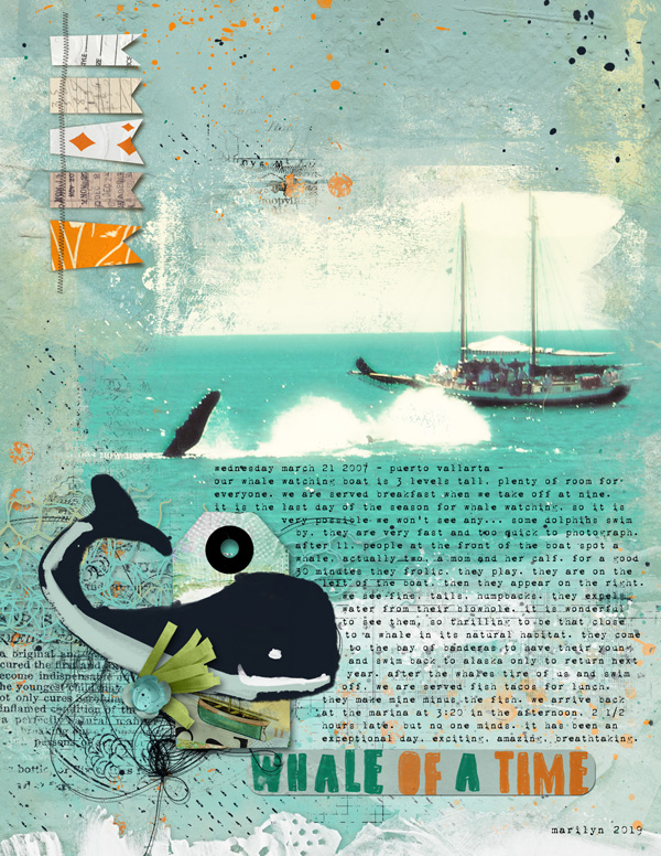
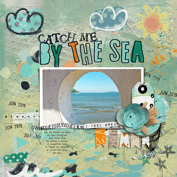
Here is my page with no overlay, just the original. (I used my Salt Air Bundle to create this layout which is 50% off through the rest of today as part of our Something Old Something new Sale! - you can grab it for less than $4 if you buy it today).
I used the green paper which you can see as the third paper along on the right hand side on the second row from my Off The Grid Misc Paperie pack.
I dropped the coloured paper right on top of my layout and experimented with the blending modes. This is using the paper in it's coloured form with a blending mode of 'overlay'. Original layout is on the left, modified layout is on the right. This gives it a lovely pop and adds lots of lovely extra texture detail to the paper design at the bottom giving the illusion of an ocean. It did change the colour tone of the photo quite a lot though, so this one might have been better to move down the layers palette and just dropped above the original background paper, or just behind the frames.
This is using the paper in it's coloured form with a blending mode of 'soft light'. Just a subtle lighting change and nice change of colour tones from mixing the green paper on top of the blues.
This is using the paper in it's coloured form with a blending mode of 'multiply'. This is obviously much more dramatic, and I adjusted the opacity of the overlay paper here to 75%. Again if I were to have gone with this I think I would have moved my paper behind my frames so that my photo wasn't edited so heavily but it was fun to experiment. Makes me feel like I am looking at the layout through my sunglasses!
Next I desaturated the overlay paper (In Photoshop, Image > Adjustments > Desaturate) and experimented that way. With an 'overlay' blending mode . . . I think this is my favourite of them all, I LOVE the 'pop' this created! It brightened the whole thing up nicely and we still have that illusion of ocean at the bottom . .
Desaturated paper with 'soft light' overlay mode . . .
Desaturated paper with 'multiply' overlay mode and reduced opacity to 75% . . .
You could also play with the levels and the curves of the overlay paper to further adjust and customise your results, in Photoshop both of these settings can be tweaked in Image > Adjustments.
These same principles can be applied to editing photos, and if you find that you like the results, but not on faces or body parts you could consider creating a layer mask on the overlay paper layer and with black set as your foreground colour and using a soft brush, erase the texture from places you don't want it to be visible.
I hope you found these tips helpful! Don't hesitate to reply with any questions or thoughts!
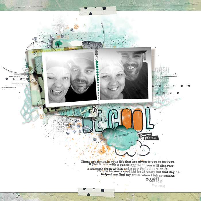
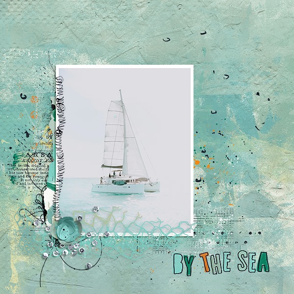
If you'd like more inspiration using Salt Air which is on sale today my team of Captivating Sistas, special guests and the Pollys have created some new pages to inspire you.
